CSS kullanarak şekiller oluşturmak
Güncelleme: CSS3 ile birlikte aşağıdaki liste ve stiller güncellendi
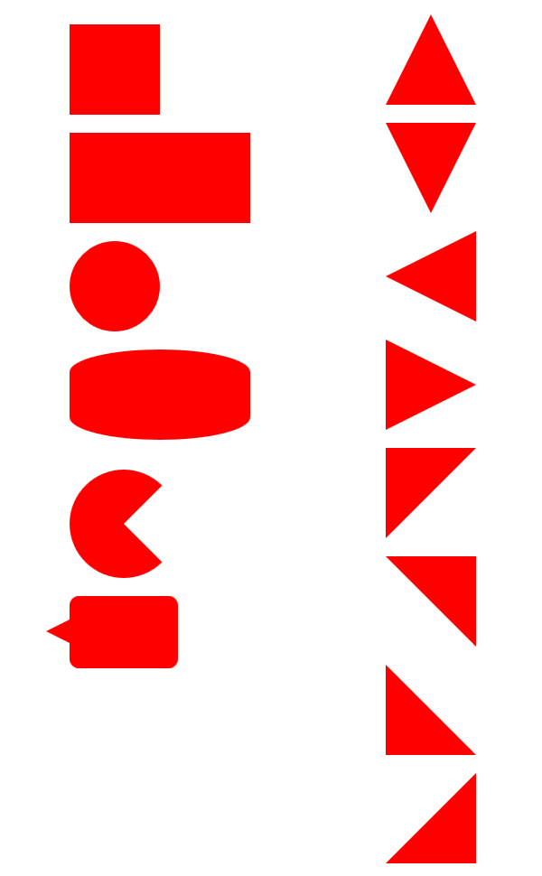
CSS stillerini kullanarak web sayfalarına çeşitli şekiller ekleyebiliriz.
Aşağıdaki listede kullanabileceğiniz birçok şekil bulunmakta;
#square { width: 100px; height: 100px; background: red; }
#rectangle { width: 200px; height: 100px; background: red; }
#circle { width: 100px; height: 100px; background: red; border-radius: 50%; }
#oval { width: 200px; height: 100px; background: red; border-radius: 100% / 50%; }
#triangle-up { width: 0; height: 0; border-left: 50px solid transparent; border-right: 50px solid transparent; border-bottom: 100px solid red; }
#triangle-down { width: 0; height: 0; border-left: 50px solid transparent; border-right: 50px solid transparent; border-top: 100px solid red; }
#triangle-left { width: 0; height: 0; border-top: 50px solid transparent; border-right: 100px solid red; border-bottom: 50px solid transparent; }
#triangle-right { width: 0; height: 0; border-top: 50px solid transparent; border-left: 100px solid red; border-bottom: 50px solid transparent; }
#triangle-topleft { width: 0; height: 0; border-top: 100px solid red; border-right: 100px solid transparent; }
#triangle-topright { width: 0; height: 0; border-top: 100px solid red; border-left: 100px solid transparent; }
#triangle-bottomleft { width: 0; height: 0; border-bottom: 100px solid red; border-right: 100px solid transparent; }
#triangle-bottomright { width: 0; height: 0; border-bottom: 100px solid red; border-left: 100px solid transparent; }
#star-six { width: 0; height: 0; border-left: 50px solid transparent; border-right: 50px solid transparent; border-bottom: 100px solid red; position: relative; } #star-six:after { width: 0; height: 0; border-left: 50px solid transparent; border-right: 50px solid transparent; border-top: 100px solid red; position: absolute; content: “”; top: 30px; left: -50px; }
#pacman { width: 0px; height: 0px; border-right: 60px solid transparent; border-top: 60px solid red; border-left: 60px solid red; border-bottom: 60px solid red; border-top-left-radius: 60px; border-top-right-radius: 60px; border-bottom-left-radius: 60px; border-bottom-right-radius: 60px; }
#talkbubble { width: 120px; height: 80px; background: red; position: relative; border-radius: 10px; } #talkbubble:before { content:””; position: absolute; right: 100%; top: 26px; width: 0; height: 0; border-top: 13px solid transparent; border-right: 26px solid red; border-bottom: 13px solid transparent; }
Kaynak: Shapes of CSS
- Kategori:
- Web (46)
Engin Polat hakkında
Senior Software Engineer, @Microsoft
Ada ve Ege'nin babası ;)
Kategoriler
Arşiv
- Şubat 2018 (1)
- Ocak 2018 (2)
- Aralık 2017 (3)
- Kasım 2017 (3)
- Ekim 2017 (2)
- Eylül 2017 (2)
- Ağustos 2017 (2)
- Temmuz 2017 (2)
- Haziran 2017 (4)
- Mayıs 2017 (4)
- Nisan 2017 (5)
- Mart 2017 (4)
- Şubat 2017 (4)
- Ocak 2017 (6)
- Aralık 2016 (9)
- Kasım 2016 (3)
- Ekim 2016 (5)
- Eylül 2016 (5)
- Ağustos 2016 (3)
- Temmuz 2016 (2)
- Haziran 2016 (2)
- Mayıs 2016 (6)
- Nisan 2016 (7)
- Mart 2016 (13)
- Şubat 2016 (14)
- Ocak 2016 (12)
- Aralık 2015 (8)
- Kasım 2015 (5)
- Ekim 2015 (1)
- Eylül 2015 (1)
- Ağustos 2015 (1)
- Temmuz 2015 (1)
- Haziran 2015 (2)
- Mayıs 2015 (4)
- Nisan 2015 (4)
- Mart 2015 (2)
- Şubat 2015 (4)
- Ocak 2015 (5)
- Aralık 2014 (5)
- Kasım 2014 (3)
- Ekim 2014 (1)
- Eylül 2014 (1)
- Ağustos 2014 (3)
- Temmuz 2014 (2)
- Haziran 2014 (2)
- Mayıs 2014 (5)
- Nisan 2014 (2)
- Mart 2014 (1)
- Şubat 2014 (1)
- Ocak 2014 (2)
- Aralık 2013 (1)
- Kasım 2013 (1)
- Ekim 2013 (1)
- Eylül 2013 (2)
- Ağustos 2013 (6)
- Temmuz 2013 (5)
- Haziran 2013 (3)
- Mayıs 2013 (5)
- Nisan 2013 (4)
- Mart 2013 (7)
- Şubat 2013 (10)
- Ocak 2013 (3)
- Aralık 2012 (7)
- Kasım 2012 (1)
- Ekim 2012 (2)
- Eylül 2012 (1)
- Ağustos 2012 (2)
- Temmuz 2012 (1)
- Haziran 2012 (2)
- Mayıs 2012 (2)
- Nisan 2012 (3)
- Mart 2012 (2)
- Şubat 2012 (2)
- Ocak 2012 (1)
- Aralık 2011 (1)
- Kasım 2011 (9)
- Ekim 2011 (8)
- Eylül 2011 (2)
- Ağustos 2011 (7)
- Temmuz 2011 (5)
- Haziran 2011 (4)
- Mayıs 2011 (3)
- Nisan 2011 (1)
- Mart 2011 (1)
- Şubat 2011 (1)
- Ocak 2011 (1)
- Aralık 2010 (1)
- Kasım 2010 (1)
- Ekim 2010 (4)
- Eylül 2010 (14)
- Ağustos 2010 (8)
- Temmuz 2010 (15)
- Haziran 2010 (1)
- Mayıs 2010 (2)
- Nisan 2010 (2)
- Mart 2010 (14)
- Şubat 2010 (24)
- Ocak 2010 (40)
- Aralık 2009 (23)
- Kasım 2009 (27)
İstatistik
Makale Adedi: 484